I can't let a workshop go by without doing an exercise using Complimentary colors. Personally, I am a little bit jealous that these six colors have a complimentary color that makes them look their best if side by side. How great would it be if we all had a complimentary color. Someone to stand next to us an make us look our very best and brightest. I guess that's why we dress in certain colors, although I mostly wear shades of grey, so I am not so sure what that says about me.
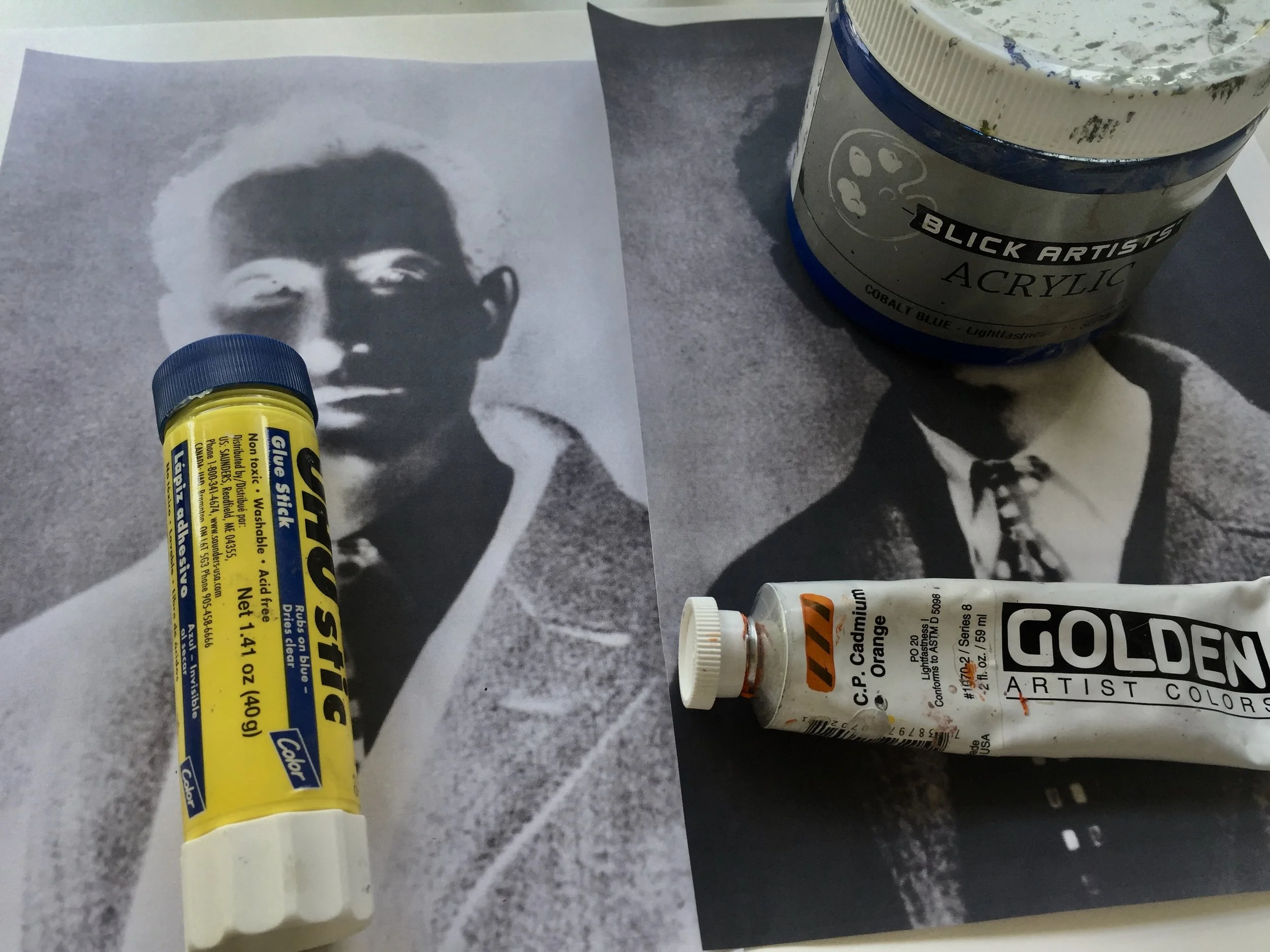
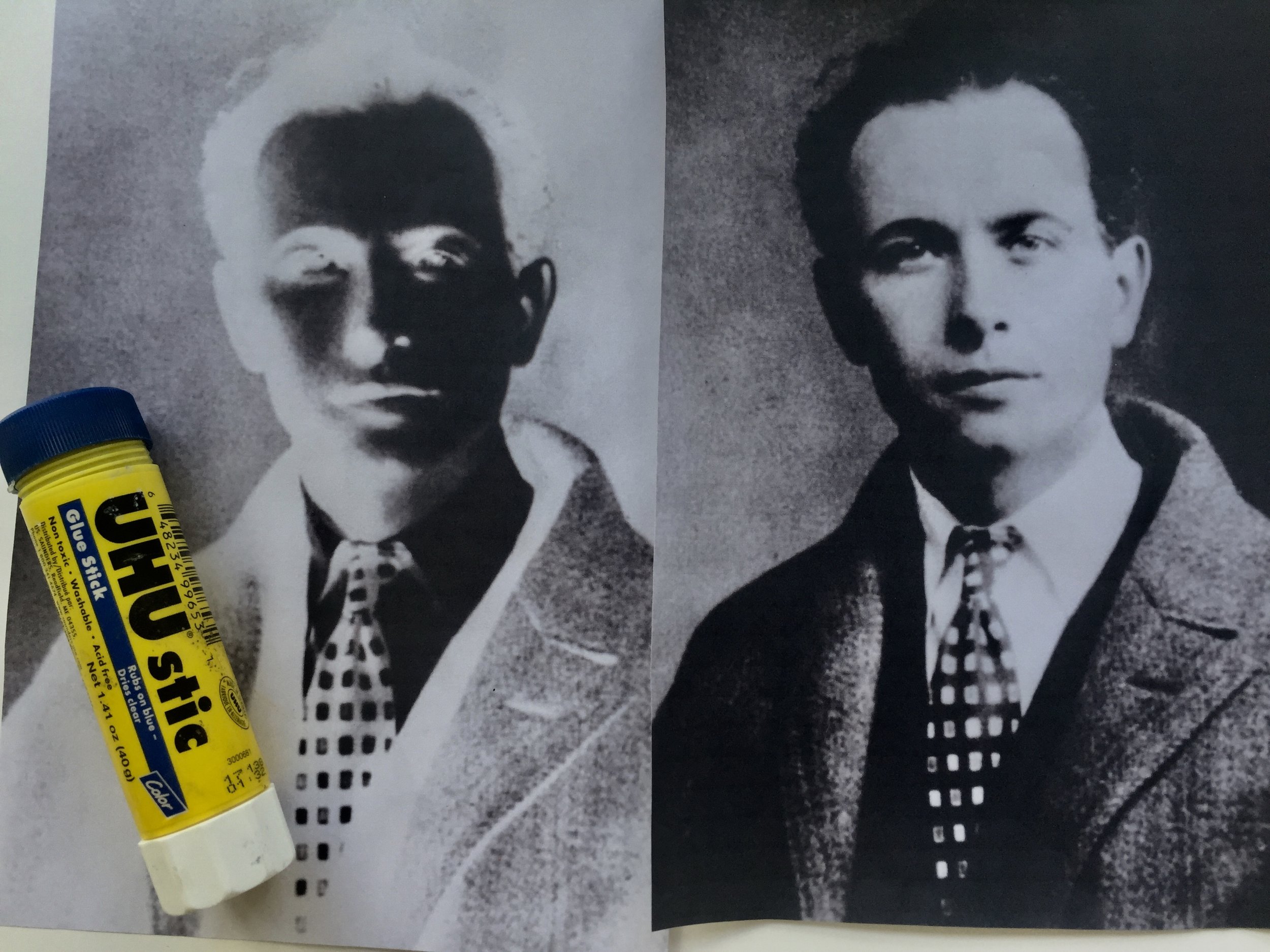
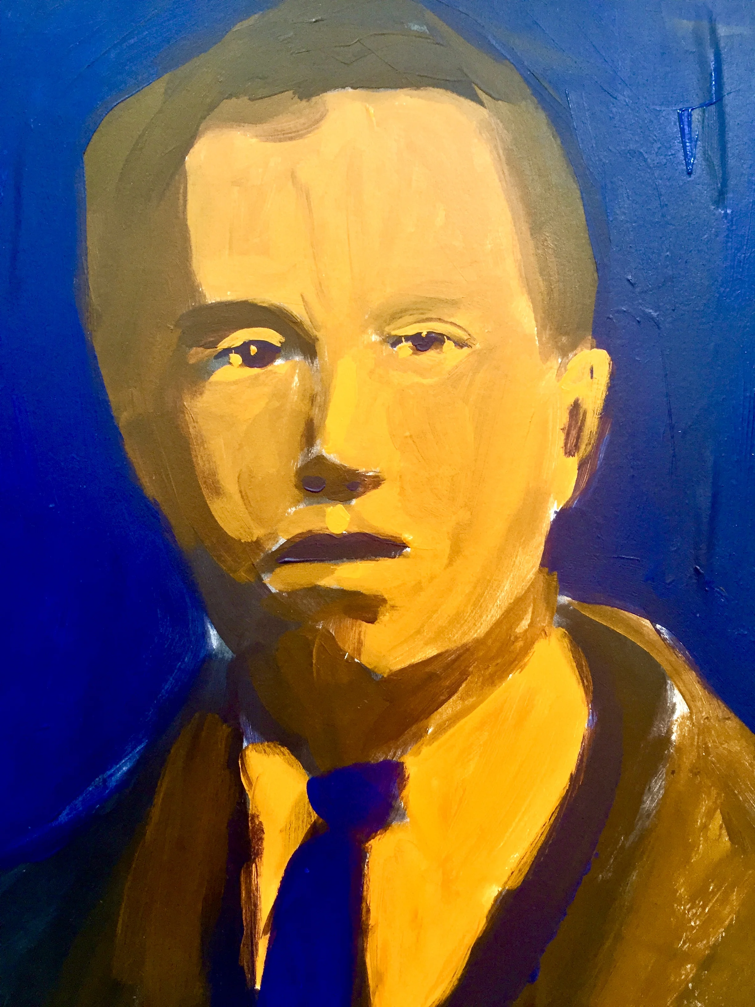
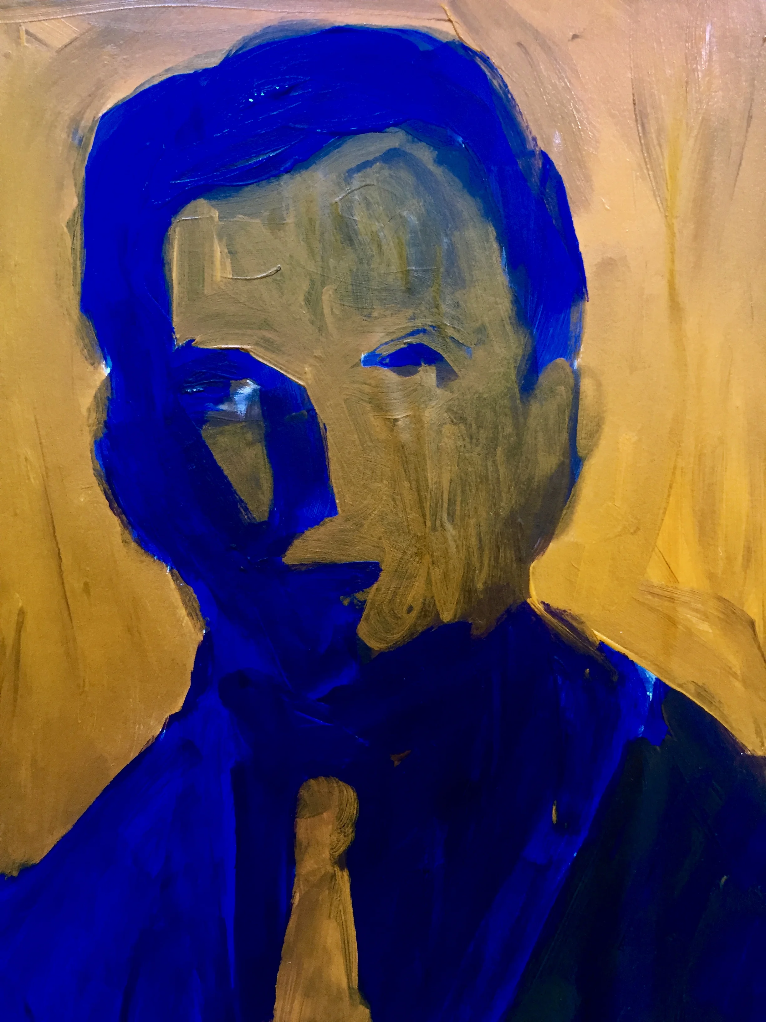
For this exercise I used Blue and Orange, my two favorite colors. You can use Green + Red, Yellow + Purple, or Orange + Blue. I also used a regular portrait, glued down to paint over, and an inverted image of the same portrait glued down next to it. On the normal portrait I used the orange for the lightest color and for the inverted image I used blue for the lightest color. You can use the same color as the light for both, or change it up as I did. I feel that these kind of exercises help keep your brain stimulated.
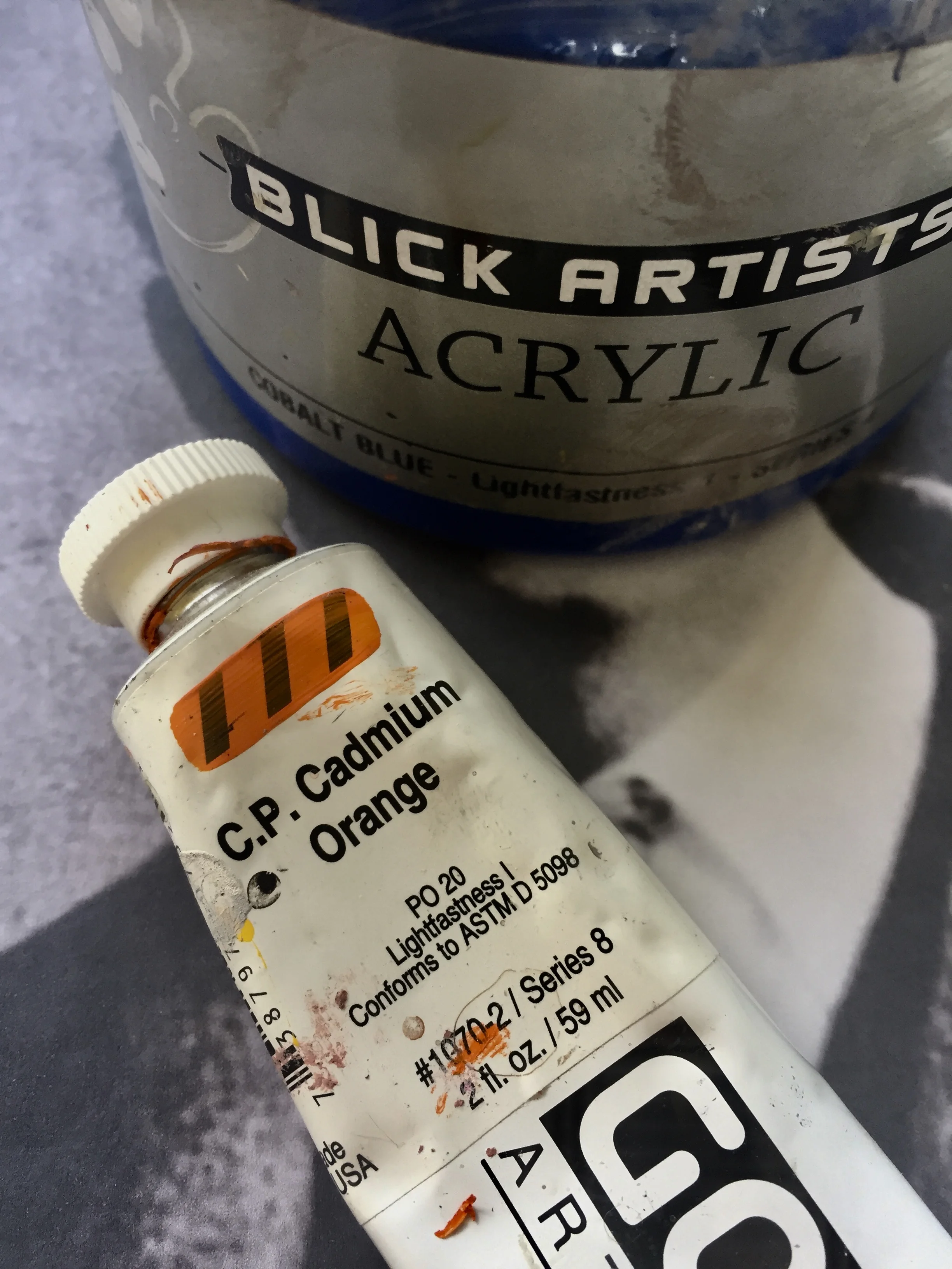
I used Acrylic paint, but you could use oils or gouache or encaustic.
Password: 100works